Valorize your documents visually
Visual representation of key working tools | Mandate Swiss Agency for Development and Cooperation SDC | Concept and design Hynek Bures, Ehud Graf | Language English | Year 2021-22
As part of our backstopping mandate for the Swiss Agency for Development and Cooperation SDC we propose visual ideas on how to promote key documents and how to help its employees to understand how different working papers relate to each other: We create visual representations of document clusters.
The visual representation starts with the needs and vision of the client. Key questions to ask before starting to work on the visuals: Who will be using the documents? How will these documents be used? Are the documents to be viewed in sequence or in a random order? What visuals have been used in the past that need to be considered when proposing new ones?
On a technical note: The graphics are inserted into Sharepoint 2013 pages as an html5 page. Html5 allows you to do almost anything you want online without needing extra software. It is supported on all devices and browsers.
Here below a few examples:
Reimagining the wheel

The conflict sensitive program management toolbox is composed of 9 activity areas, each with its own set of documents/tools. In this example we adapted the original format to create a new look.
Relating through colors
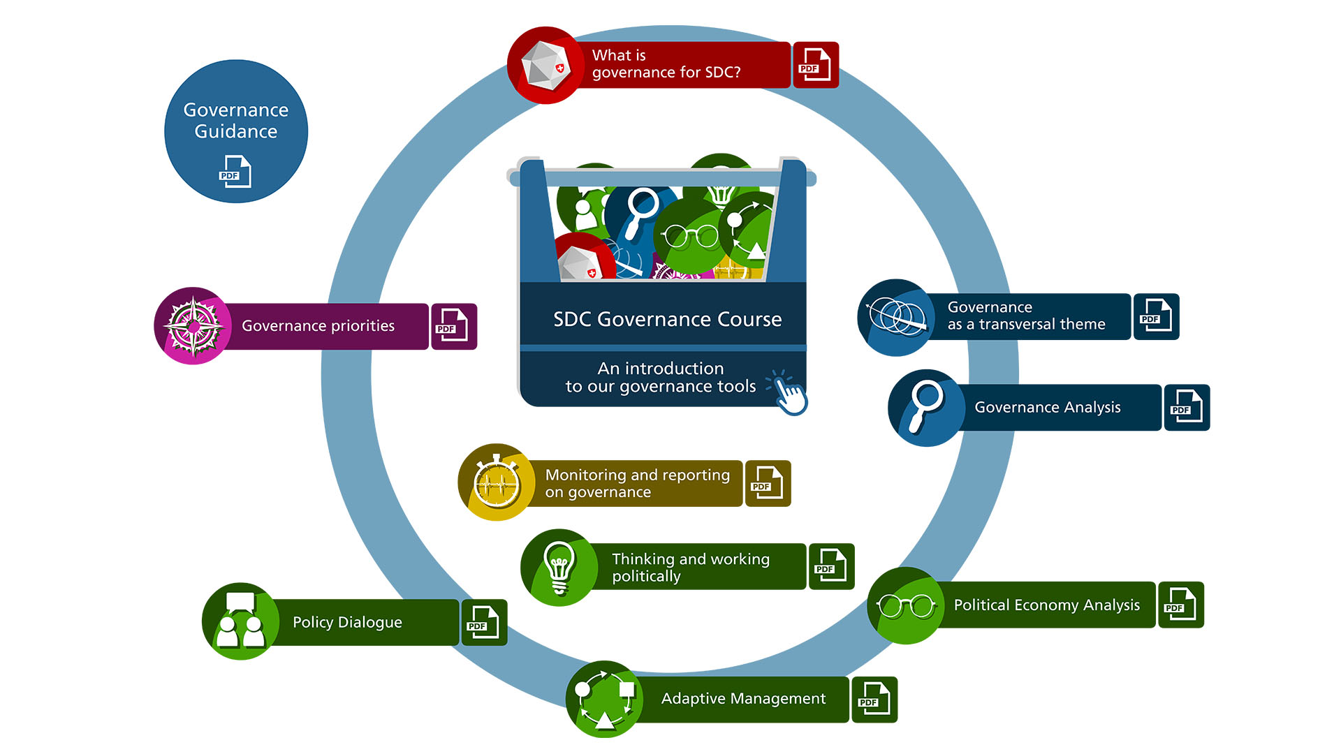
This graphic visualizes 10 documents. Again, the documents are clustered into 5 color codes. But since each document/tool has a life outside its cluster, we created individual icons that can be used to refer to the document/tool in other contexts. To promote the use of these tools, we placed the link to an online learning module at the center of the graphic.
With a short introduction

Here the 4 pillars in orange are at the center of the working aid. For the visitors to quickly find the right tool, a short description is displayed on the right side.